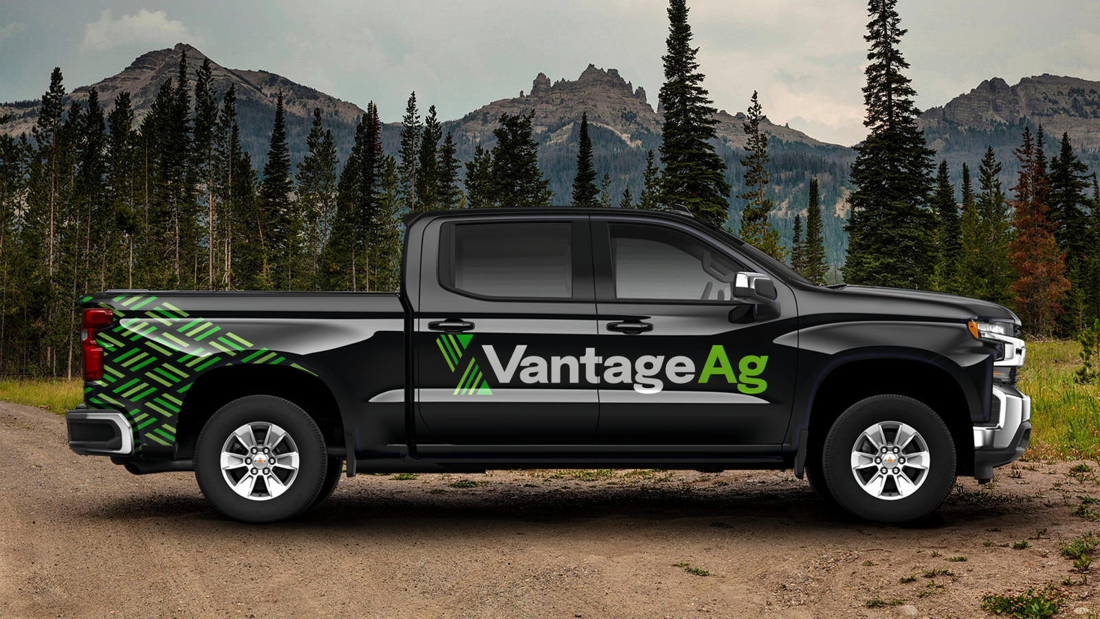
Vantage Ag is a manufacturer and distributor of liquid fertilizers. Offering a fresh approach and choice over the big companies, Vantage Ag helps increase growers’ chances for success.
Catering to independent ag dealers, agronomists and growers, the team at Vantage Ag are experts at building high-value relationships through high-value products and a customized approach. They understand the unique challenges that farmers face and aim to remove barriers with their new fertilizer technology that’s environmentally-friendly, high-efficiency and liquid technology.
Vantage Ag wanted to position itself as an independent manufacturer and distributor, appealing to both large and small agricultural companies. Focusing on technology and products, our goal was to gain potential new clients across North America.
Challenge Accepted
Working closely with the Vantage Ag team, we were able to create a new design that reflects their brand, and build a new website that effectively tells their story and conveys why they’re different from other distributors.
Big Goals Lead to Big Gains
The project scope included:
- Brand strategy
- Personas
- Key messaging
- Brand identity
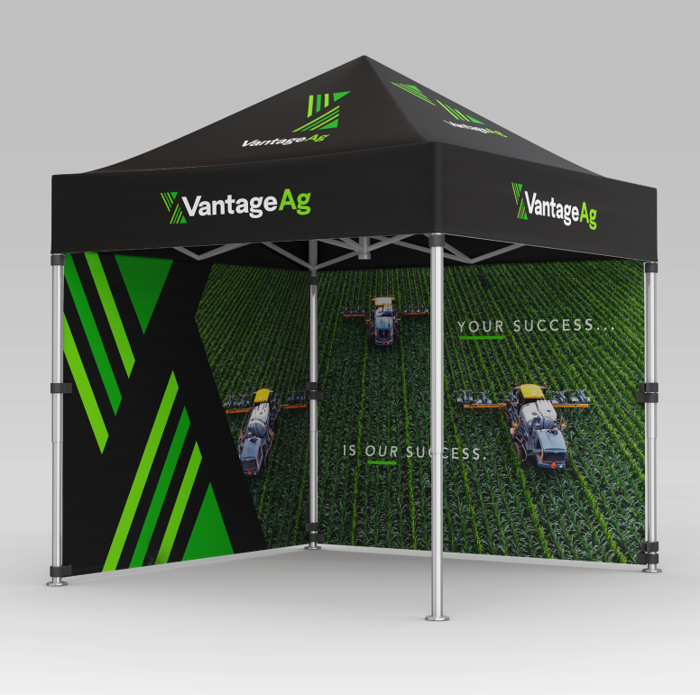
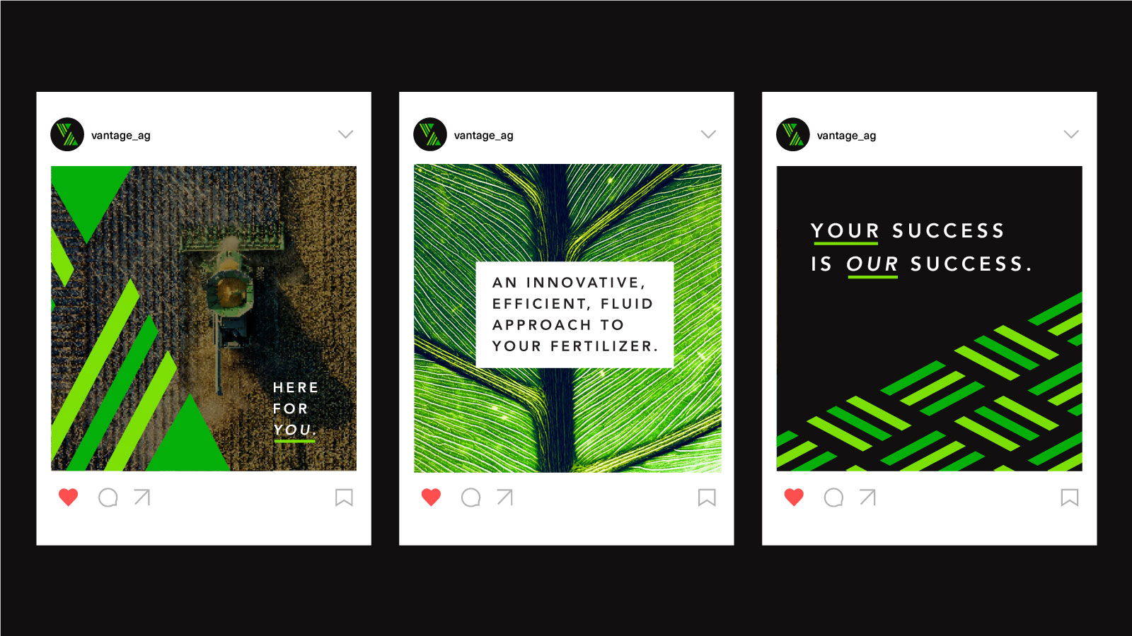
- Marketing assets
- Business cards
- Slide deck templates
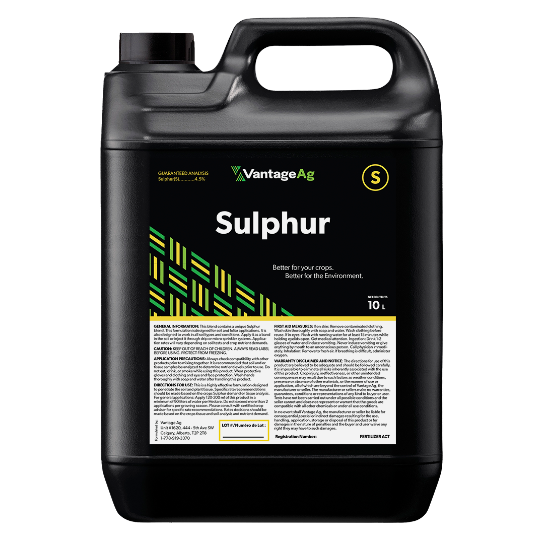
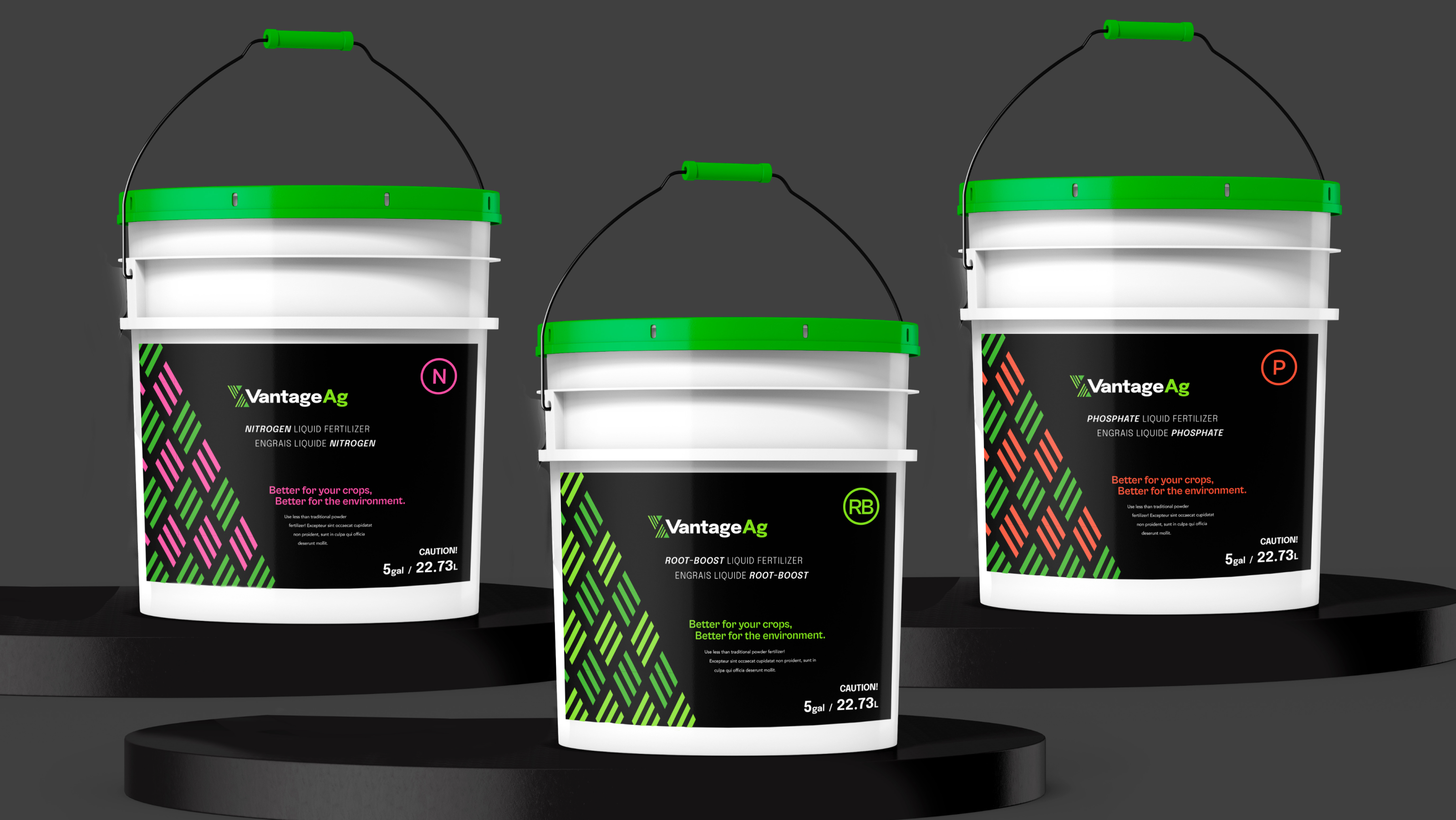
- Product packaging
- Custom design & strategic site architecture
- Custom infographics
- Site architecture comprehensively built with users in mind
- Website design & development
Getting Down to Business
Brand Identity
Our goals with this brand were to convey a feeling of strength & approachability, while also showcasing how they are technologically advanced & innovative.
We created a scalable design that is professional, yet simple to manage. Without being overly complex, the brand can grow and evolve as the business does.
Logo
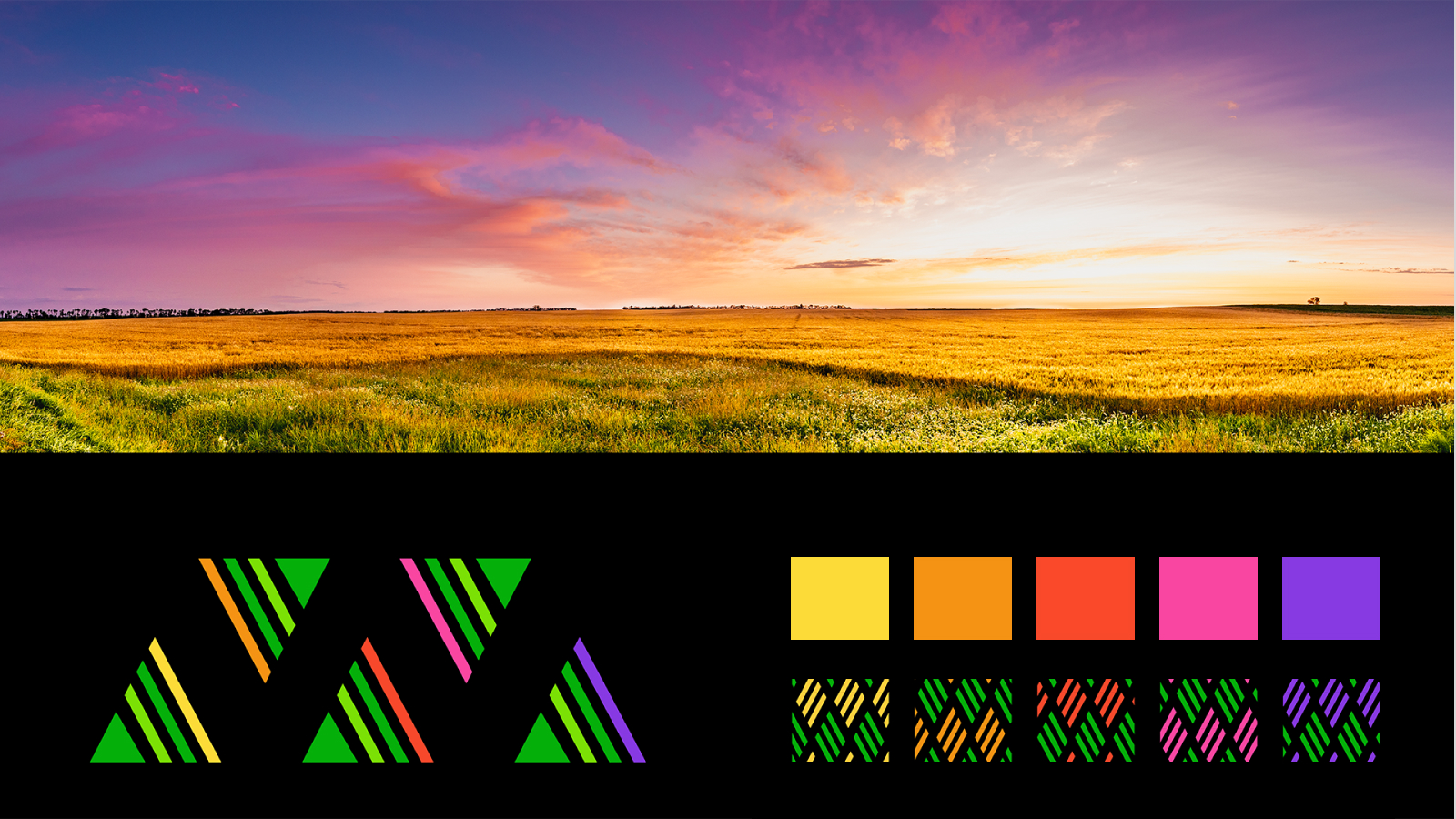
The Vantage Ag logo is simple, clean, and recognizable. It is composed of small line shapes, which play homage to the rows in a farmer’s field. These small lines create two larger triangle shapes that represent the letters V and A in the company’s name.
Colour Palette
Colour is an integral part of Vantage Ag’s brand identity, and reinforces the cohesiveness of the brand. The primary colours are Sprout Green and Harvest Green, with Black as the main accent colour.
Green is symbolic of the prairies of Saskatchewan, and is known to symbolize growth and renewal. The secondary colours complement the primary colours and represent “dusk to dawn” – Dedicated and hard-working, a farmer’s work never ends.

Website
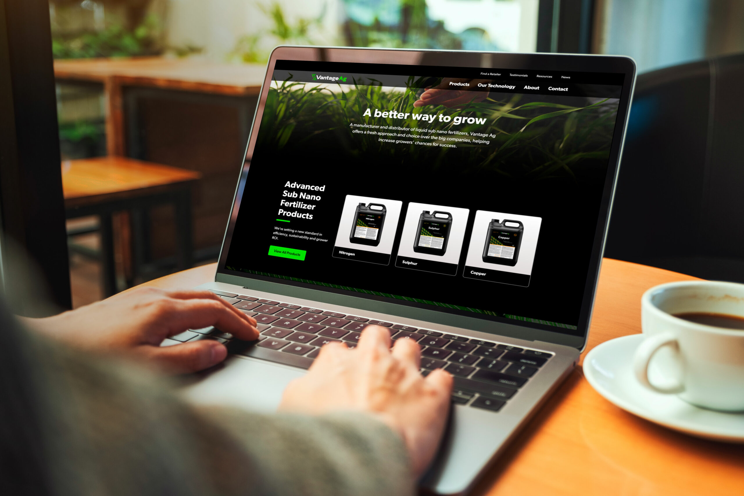
We needed to create a website that features product details with images and concise descriptions, designed to drive potential new clients to contact Vantage Ag’s team. The design is meant to be scalable, flexible, user-friendly, and easy to navigate, all while meeting accessibility guidelines.
Leveraging Vantage Ag’s new branding, we used images and illustrations to further highlight their technology, educating end-users about the benefits of their products.
Photography
The Vantage Ag brand is about supporting farmers through the innovation of fertilizer technology, and strong relationship building. The images are meant to balance the stories of these people and the positive effects of Vantage’s fertilizer product.
The photography is clean, natural and professional. We wanted to focus on 3 main aspects: Showcasing agricultural fields from above, relatable farmers at work, and the macro detailed images of plants and all their parts.
Infographic
Combining design and development, we created a custom animated infographic to highlight and explain how Vantage Ag’s sub nano technology actively works. The infographic visually breaks down technical information in a digestible way. Oh, and did we mention that it’s cool to look at too!
Celebrating The Wins
Our partnership with Vantage Ag was collaborative and creative. We created a bold and refreshing design that sets Vantage Ag apart, while showcasing them as a leader in their industry.
Paul, Founder“Rock & Bloom does outstanding work, we have had many compliments from our customers on the site.”
Check out their new website to learn more about how they’re changing the game for growers everywhere.